Experience Design of an Invisible Bank

CLIENT:
One of the biggest banks of Southeast Asia
MY ROLE:
Product Innovation Lead
Lead Experience Designer
Product Discovery Lead
Workshop Facilitator
Experience Designer
SUMMARY:
The brief was to pitch a blue-sky vision to the client by showcasing how the experience of an invisible bank can look and feel like.
Disclaimer: Here you will find the identities of products/client's names changed to a fictitious ZBK bank, this is to keep the confidentiality of the client intact. This applies to clients with whom I worked as an external consultant only. The rest of the details of product or client names are per the registered brand/entity/product. All the UI/UX and product design works displayed throughout my portfolio website are created by Naren Katakam.
PROBLEM STATEMENT:
The financial services industry has been remarkably resilient, 10 years since the last global economic crisis. In these 10 years, tectonic shifts have happened both in technological advancements and consumer behavior. These 10 years also saw tremendous growth of tech giants — Apple, Amazon, Google, and Alibaba. They are successfully entering adjacent markets and soon threatening to become direct competitors to any bank. They are in this position because of data. With the algorithms they run, they have the ability to sift massive amounts of data and derive consumer insights in seconds.
In this backdrop and context, what can a traditional bank do to build a competitive edge? How can they play to their strengths and become an invisible giant? Where do they start? How do they become an invisible bank? These were some questions I tried to address in my massive pitch.
MY APPROACH & MACRO PLAN FOR THE PITCH:
Background & Understanding the Bank:
I started my research by understanding the bank. Where they started from? Where they are right now? What announcements did the leader recently make? What innovation are they currently undertaking? At the innovation point, I bifurcated my research into their competitors, competitors of all sizes, even the newest digital banks.
Understanding Customers & Their Pain:
The second stage was to understand their consumers. For this, I had to slice their current market and go after the coveted niche, millennials. I studied reports and case-studies on consumer behavior, what they are looking for? Where their pain points currently are? And what are the underserved needs of these consumers are?
Blue-sky Visioning & What if?
Then in the third stage, I synthesized all the knowledge from the previous two stages and expanded my thinking asking — what if? And mapping my answers to the pains I discovered earlier. Does this what if, solve customer's pain? If yes, how can it do so, what would the new journey look like?
Technical Validation & Solution Sketching:
The final stage was the technical validation of the what-if journey. Can new technologies support this journey? If so, how? And what changes does the bank has to do in their backend systems? Once the validation was done with tech experts, I moved to solution sketching and designing a concept user interface to make the new journey possible.
WHAT IS AN INVISIBLE BANK?
One of the best definitions I’ve come across in my research was this — "The most important driver of change in the banking industry has been the smartphone. Instead of going to a branch, or an ATM, or even to a desktop, customers can now go around with the bank in their pockets. In theory, the bank can become invisible and seamlessly embed banking services into day-to-day life”.
To me, that is the core essence of modern banking and how banks have the power to seamlessly integrated into consumer’s life. Today, banks know exactly where you are spending your money on a day to day, minute to minute basis, if they have algorithms to understand the patterns of consumer behavior, then they can weave a seamless experience around finance for a new age consumer.
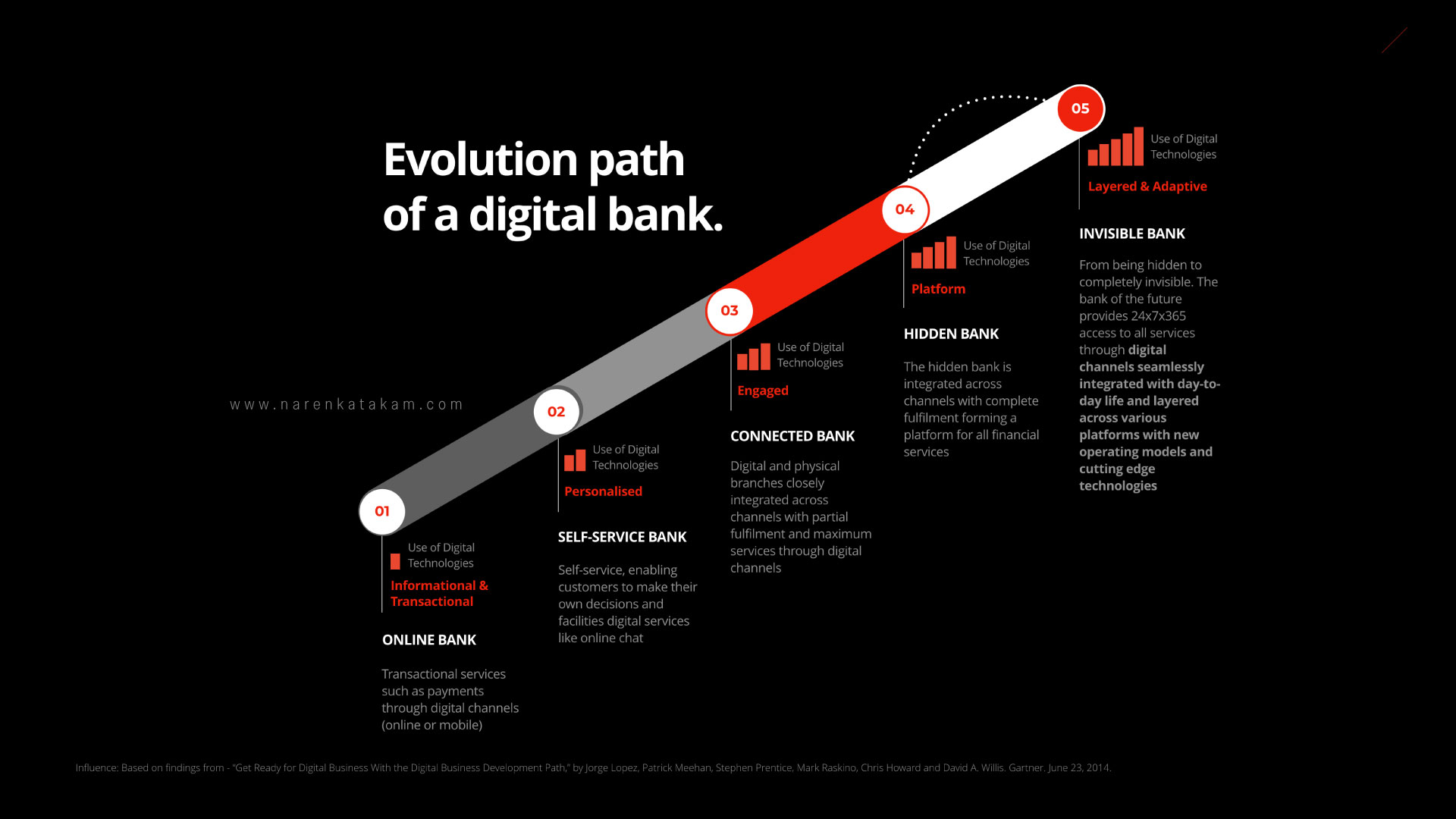
The key question is, what does it take to become an invisible bank? I found my answer in a Gartner paper — “Get Ready for Digital Business With the Digital Business Development Path,” by Jorge Lopez, Patrick Meehan, Stephen Prentice, Mark Raskino, and others, published on June 2014. They suggest — Before becoming invisible, the bank has to be hidden and the maturity path for a digital bank from an online bank to becoming an invisible bank is laid out in the below diagram.
CONSUMER CURRENT STATE & MINDSET:
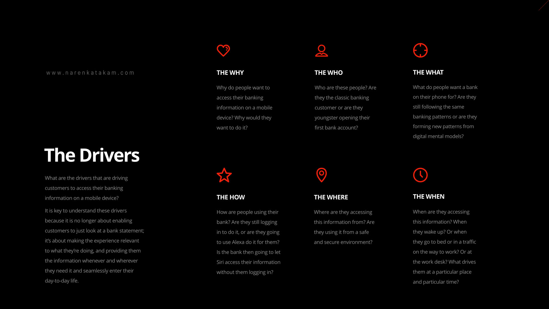
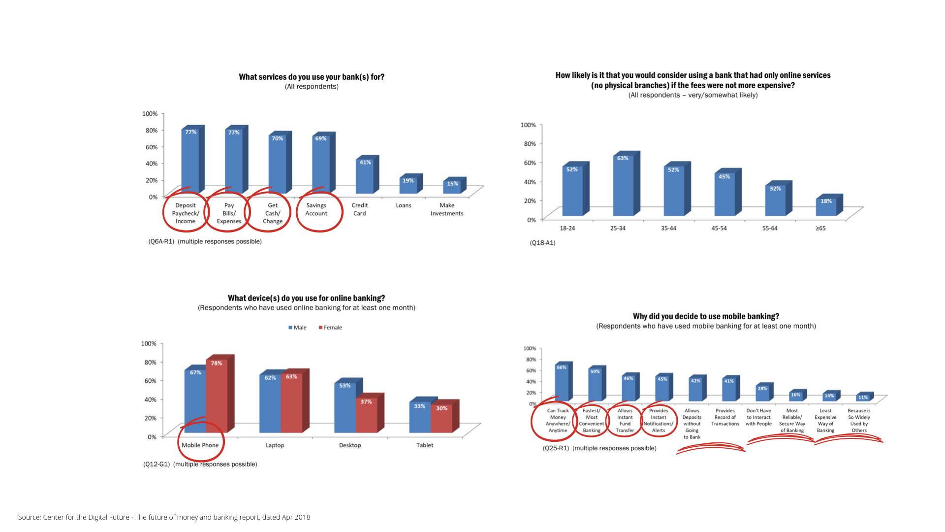
It is said that on average a human being has about 50000 to 70000 thoughts per day. Out of these thoughts, there’s a good percentage of them that revolve around money and financial transactions. My train of thought was to understand how a bank, traditional or digital (assuming that they have all the necessary data) with the help of the latest technology can cater to the underserved needs of the consumer? This thought helped me understand the key drivers, the drivers that are driving customers to access their banks on their mobile phones — why do people want to access their banking information on their mobile phones? Who are these people? Are they migrating from traditional to digital or have they started as digital consumers? What patterns are these people following while they access their banks on their mobile phones? How are they using the services? Where are they accessing from? When do they access and what information?
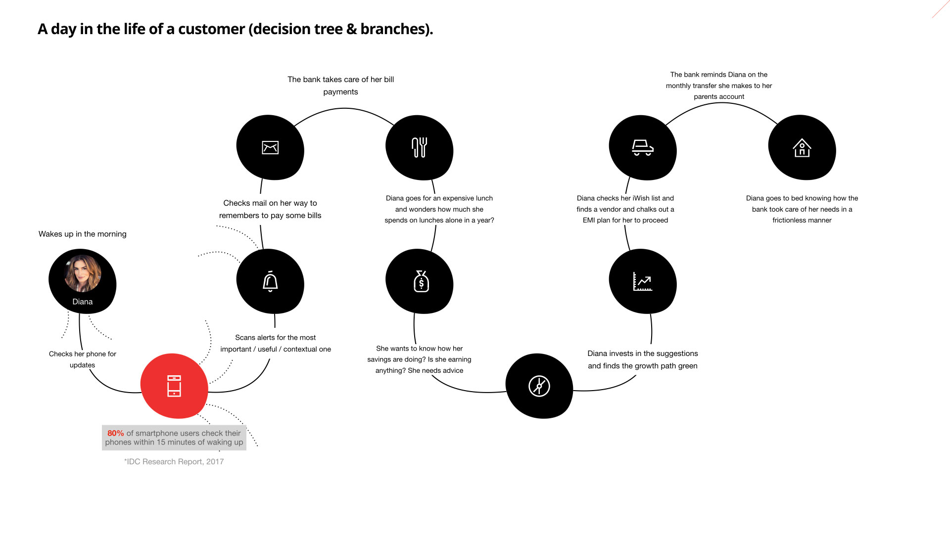
Understanding answers to these questions helped me craft a new user journey, user journey filled with what-ifs. What-ifs to address their current and future pains. What-ifs to serve the underserved. What-ifs to reimagine traditional banking and to give a digital spin.
SHIFTING TECHNOLOGY LANDSCAPE:
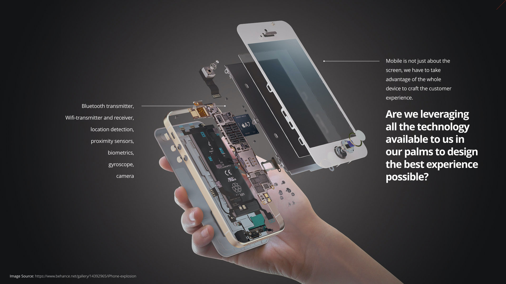
The question that really helped me expand my blue-sky visioning is — "Are we leveraging all the technology available to us in our palms to design the best experience possible?” "How best do we the technology available to us? and how much are we justifying by designing to leverage the maximum capacity of technology available to us?”
At the time of this presentation, there was a BlueTooth transmitter, wifi-transmitter and receiver, location detection, proximity sensors, biometrics, gyroscope, and camera. Camera power is only getting better each year. Today we can leverage computer vision technology using our mobile cameras. The question is again, — "Are we leveraging all the technology available to us in our palms to design the best experience possible?”
REIMAGINING THE BANK STATEMENT:
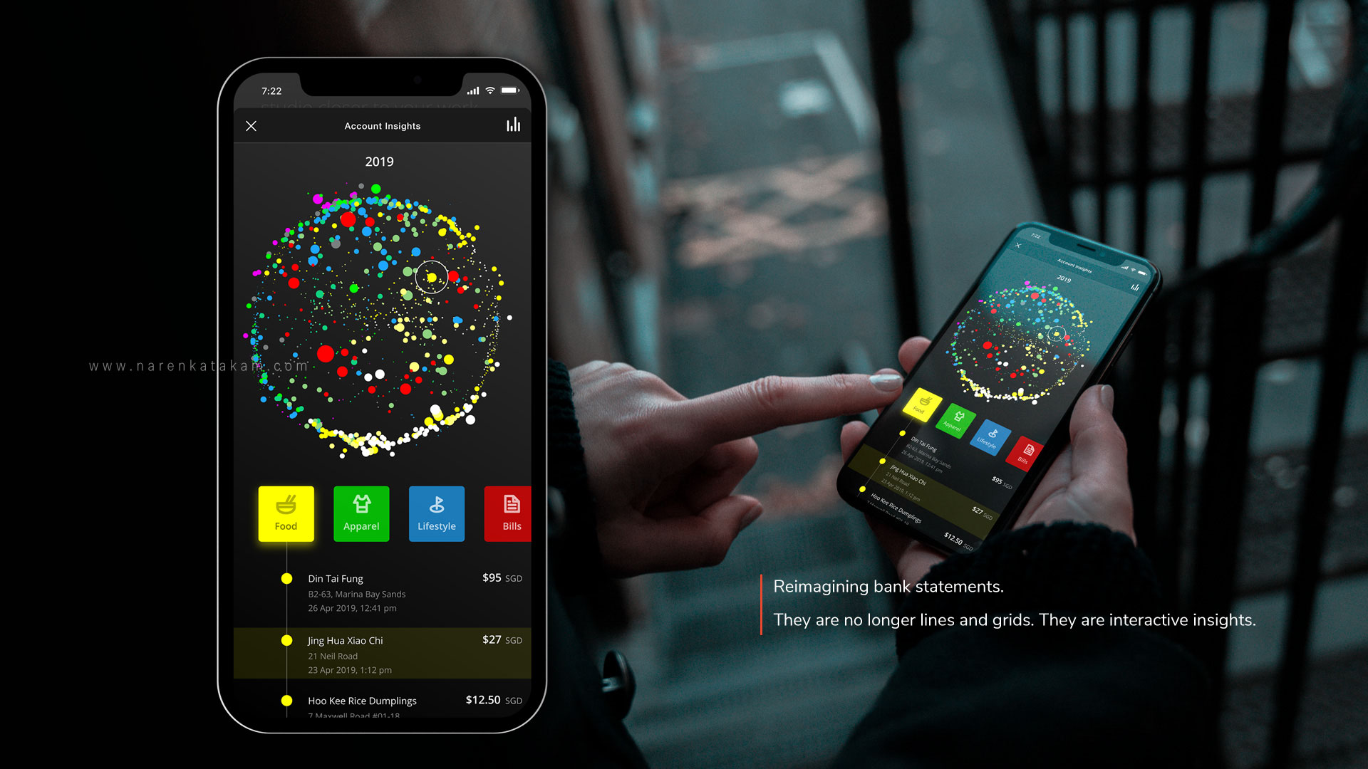
One of the fundamental thoughts that occurred to me during this exercise is to redesign the traditional lines and grids bank statement that we are still used to, to an interactive live bubble UI. The idea is to be able to get to any transaction from any timeline to understand and categorize your spend. This can enable users to understand and be aware of their spending behavior and possibly identify spending patterns — because, awareness is the key to change.
THE CONCEPTUAL DESIGN FOR AN INVISIBLE BANK:
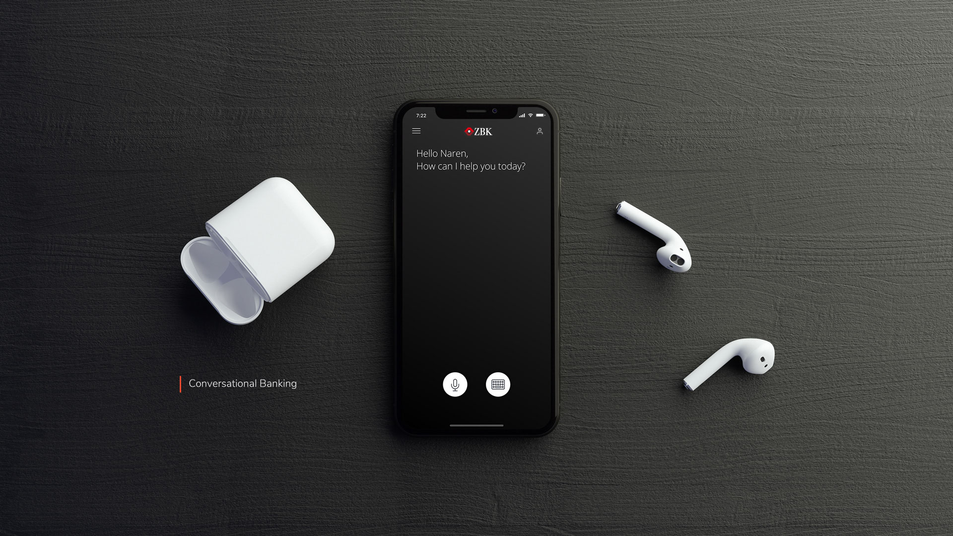
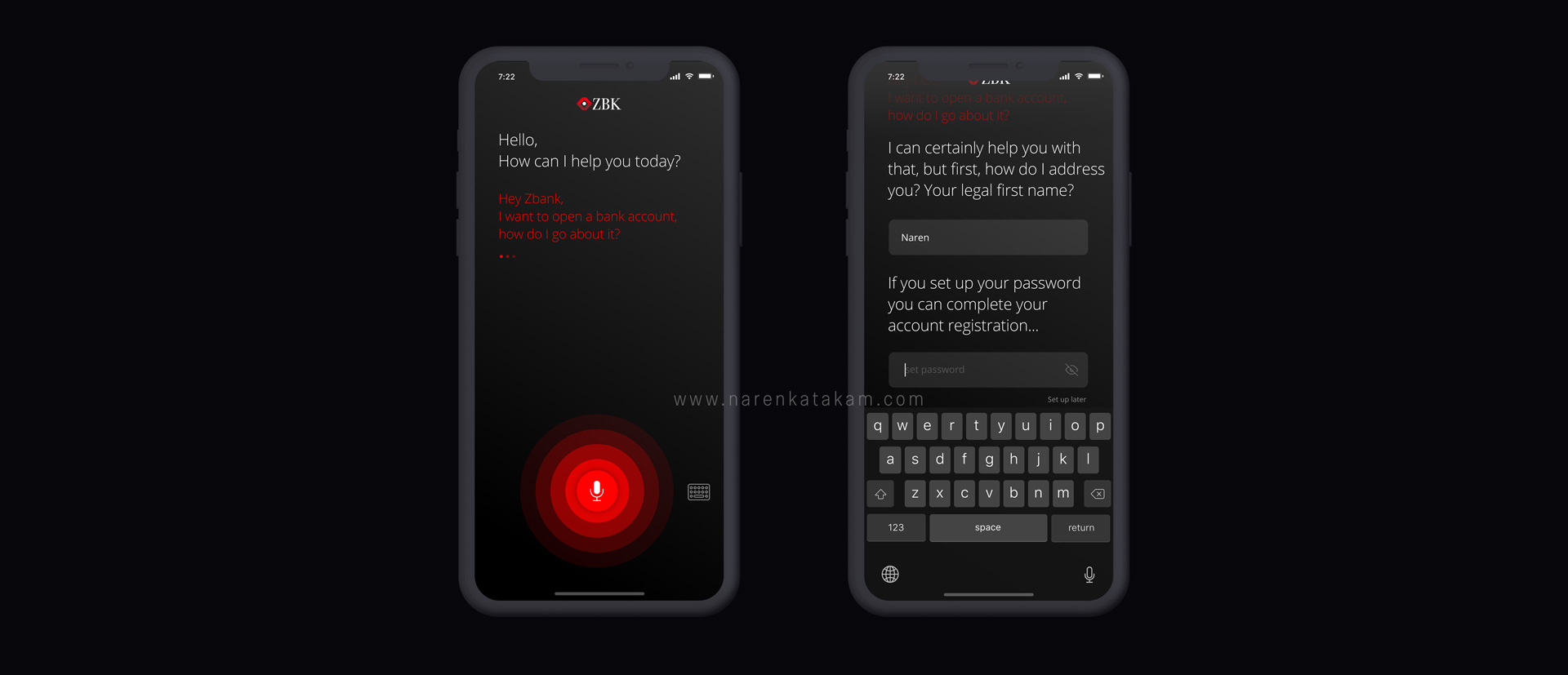
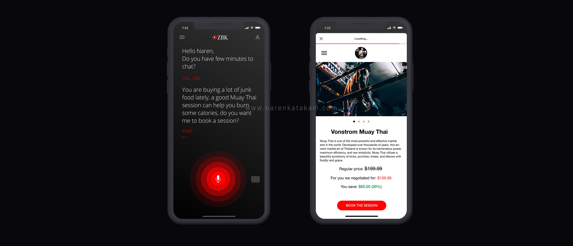
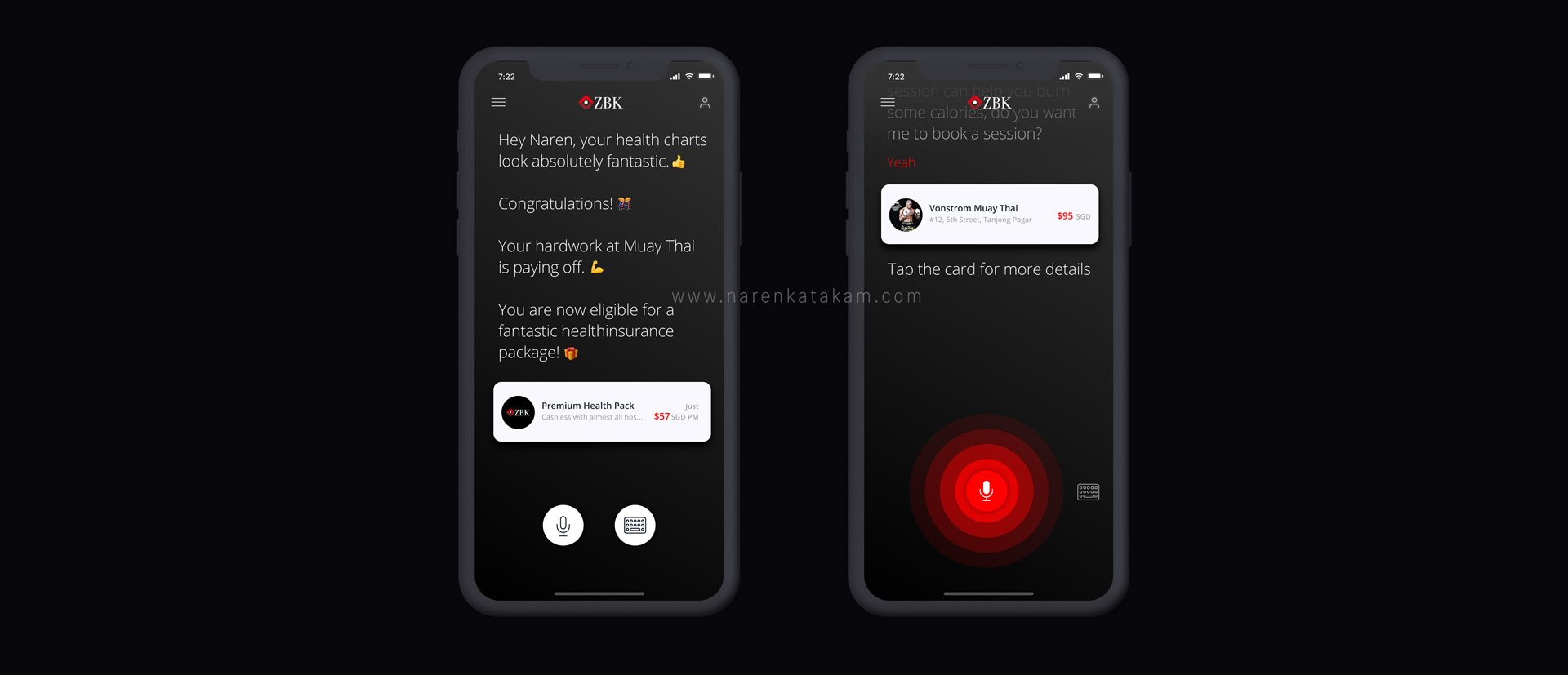
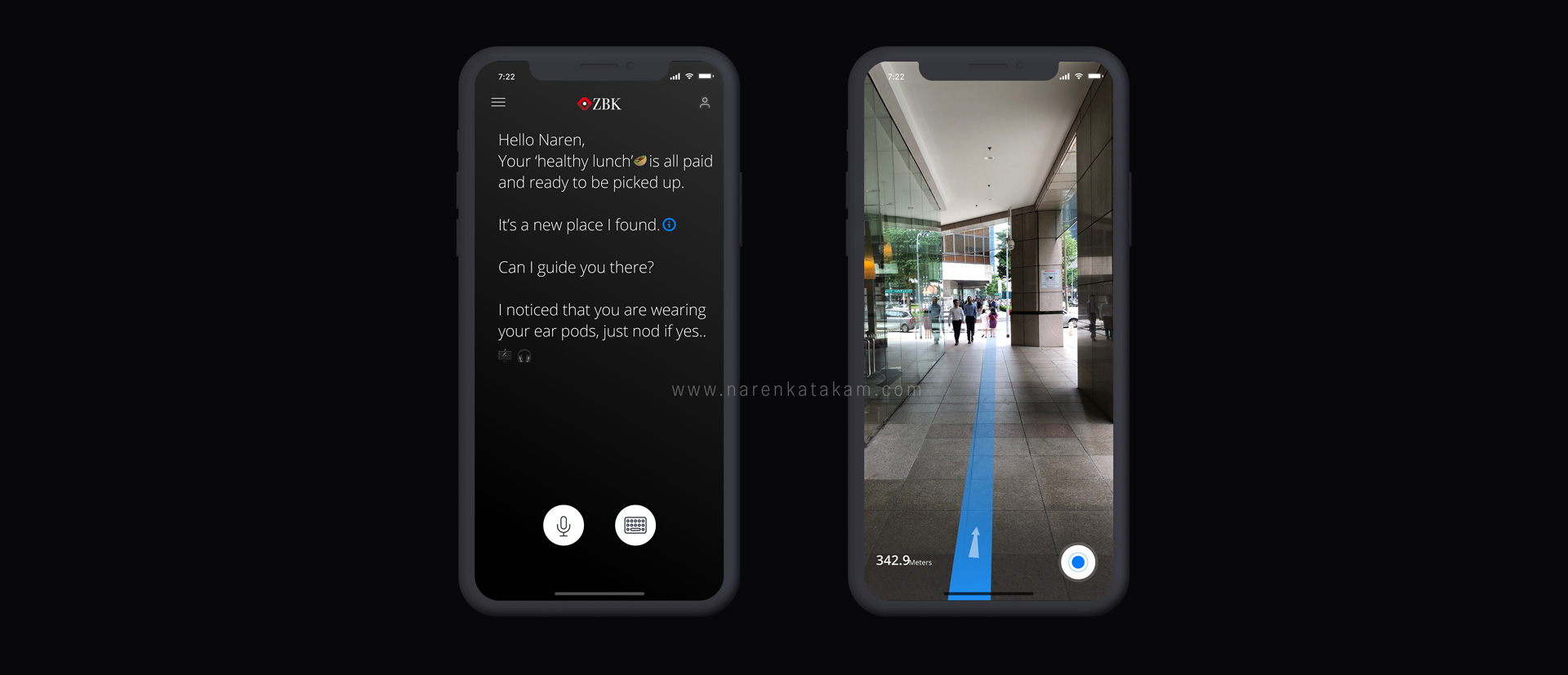
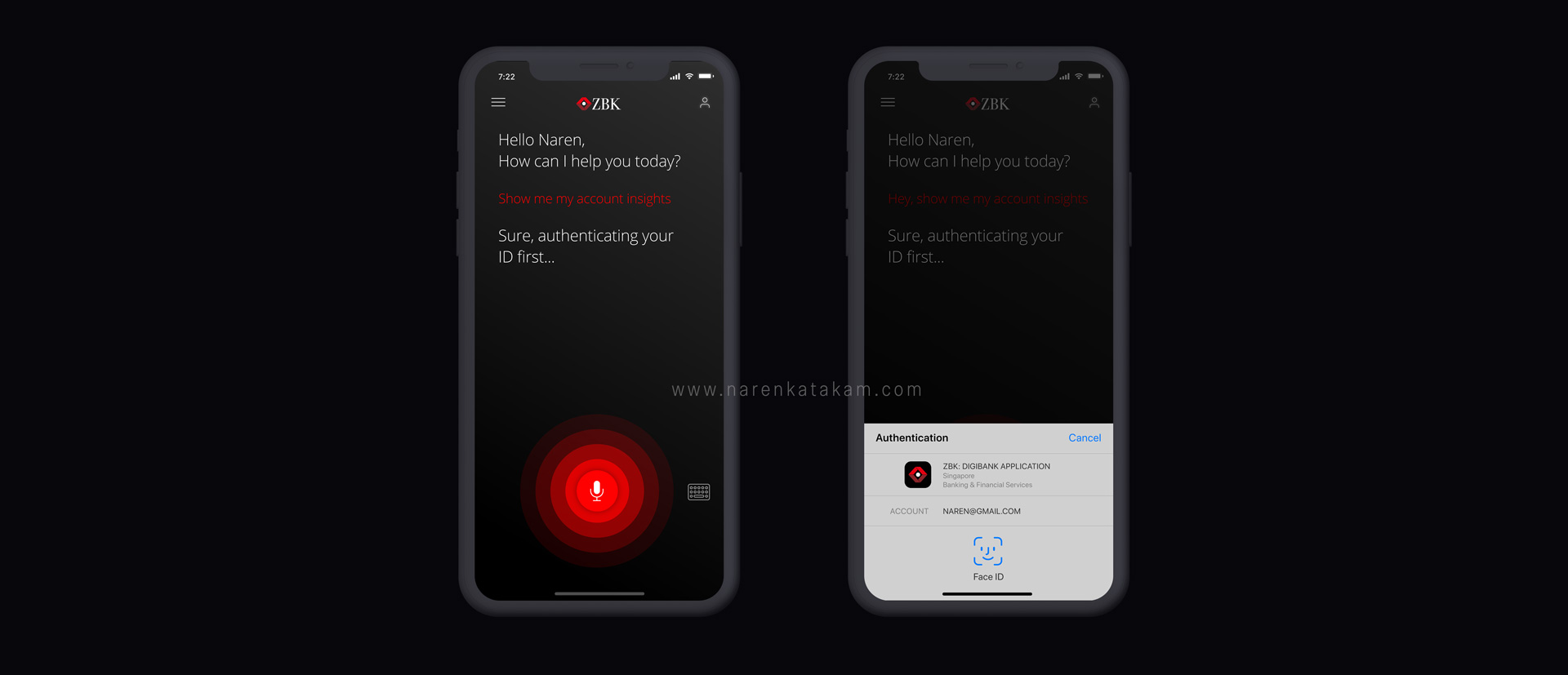
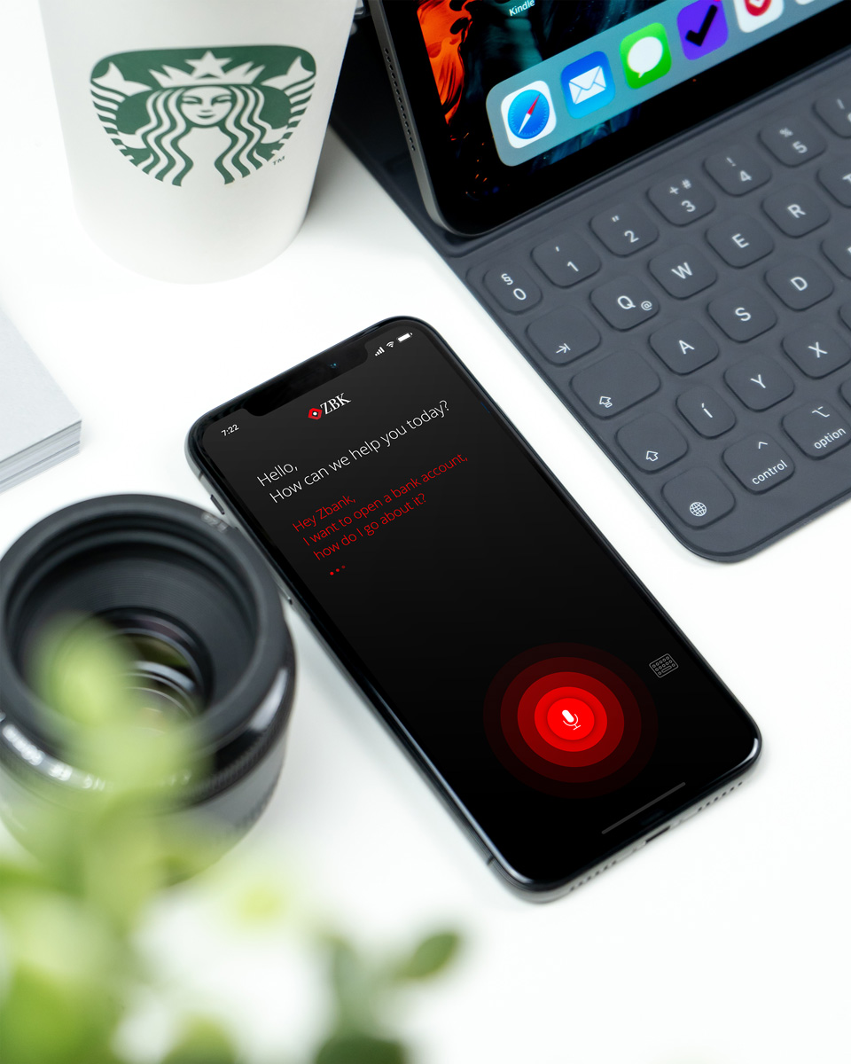
Let's take Uber's design for example, what conceptual design did the company use for its mobile application? — It’s the maps. Uber's app uses a map-centric concept design at the core. What conceptual design can an invisible digital bank that wants to utilize all the technology packed in a mobile phone can have? — My answer is conversational design. Here’s my attempt to reimagine banking using conversational UI.
WEAVING THE EXPERIENCE DESIGN WITH TECHNOLOGY:
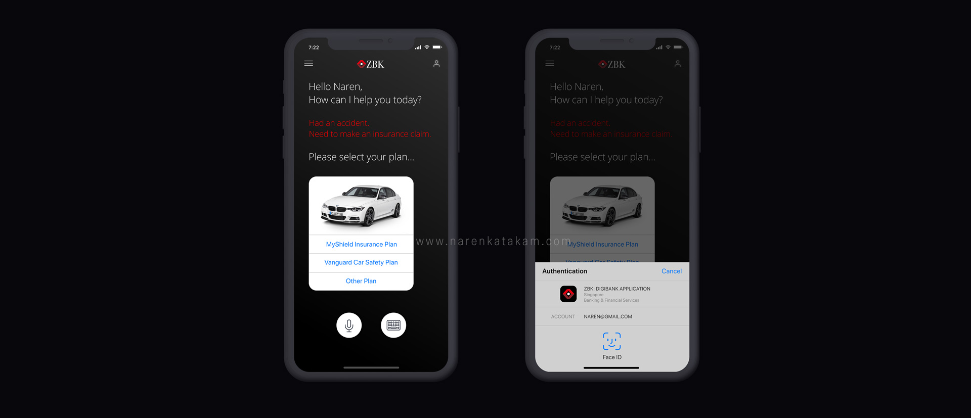
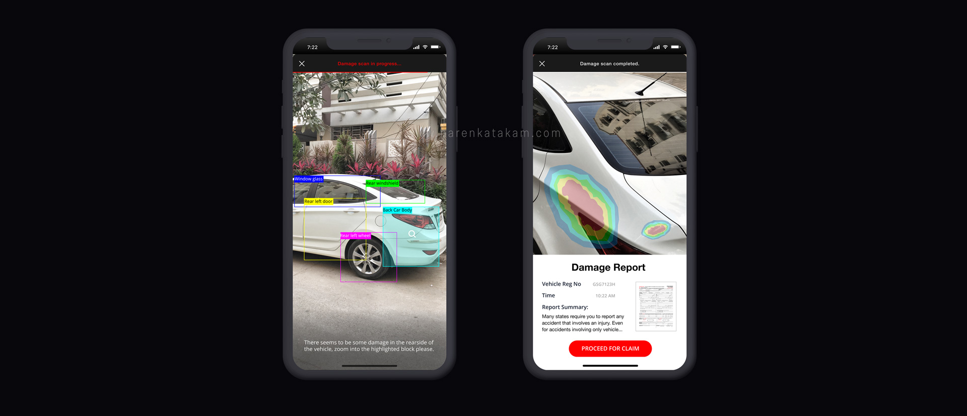
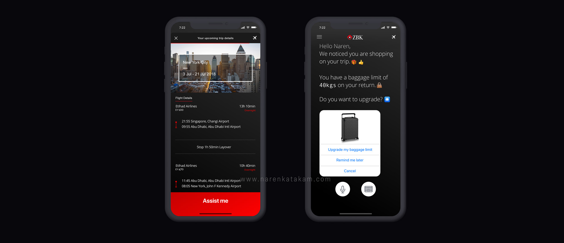
With Conversational UI as the main concept, here’s my attempt to weave an experience utilising most of the technology packed inside our mobile devices — From identifying AirPods to geofencing, from reading health kit data to cross-selling insurance, from using computer vision to process insurance claims in minutes, from understanding travel plans to upgrading luggage request on the go. I weaved a futuristic experience keeping user pains and underserved needs at the core and deeply understanding what mobile phones can do today.
Selected Works
Designing a SuperApp!Product Design
Experience Design of an Invisible BankProduct Design

Brand Design of an Healthcare Tech StartupBrand Design